Celadon: For The Whisper Man, you art directed the brilliant illustrator Will Staehle to create the cover. How did Will get involved with this project?
Twomey: I was looking at Stephen King’s The Outsider. Ryan had given me a heads up that The Whisper Man was a very “Stephen King” kind of title. I double checked, and The Outsider cover artist was Will Staehle. I worked with Will before to amazing results, so I ran it by Ryan, who was excited. And Will was excited to work with me again. I sent Will the manuscript and the brief, and we landed somewhere near Silence of the Lambs or Hitchcock…kind of a scary thriller.
Celadon: How was working with an outside designer versus working in-house?
Twomey: I’m looking for certain experts, and Will had already been an art director. In a former life, he was at HarperCollins, got promoted very quickly at a young age, and then decided to work for himself. He’s a prolific designer but also understands the parameters that publishers or salespeople might have. He knows how to push it, but he also understands the constraints, so I don’t really have to educate him about that. There are a few very talented designers that are familiar with the territory, the approval process, and what’s not gonna fly. And they like certain genres.
Celadon: Do you look for artists who specialize?
Twomey: Not that Will specializes in horror and thrillers, but I know he likes that kind of thing. He did Stephen King. He did some Michael Crichton covers. I know that he can be fresh with them, too. I can find people who can do the formula for a thriller. He’s not going to do the formula.Celadon: How long did it take Will to come back to you with designs for The Whisper Man?
Twomey: He only took a month.
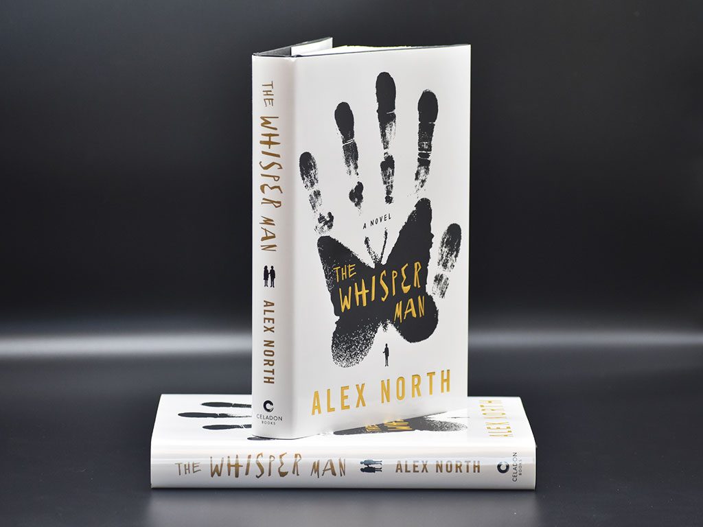
I put him on hold at one point because Ryan said we can’t have a butterfly on the cover. We didn’t want to have it compared to Silence of the Lambs. The Whisper Man protagonist is in jail, and they didn’t want those direct comparisons. Will told me that he did this beautiful piece, one of his favorite designs, of the butterfly and a hand. I said just hold on to it until we hear back. When he was finally ready to deliver, we said, ‘Yeah you can try butterflies.’
Celadon: How did you land on the final design?
Twomey: Will is very prolific, which is no big surprise, and he probably sent 15 designs. I looked at them first, then Ryan and I looked at them together, and we narrowed it down to three. There were a lot that we liked, but we wanted to bring in Jamie , and we only wanted to show her three. But we did have a favorite—the one that Will described when he said he was doing something with a butterfly and a hand. Jamie immediately said, “I know which one I like” and it was the one that we ended up using.
Celadon: The finished cover is a combination of glossy white, matte black, and embossed gold lettering. How did you make the decision to include all of those textures together?
Twomey: I knew I had budget for some of that, so I was going to go all out. I could have done a matte white background and the glossy black hand, but sometimes gold foil against shiny black can cause a mirror effect.
Sales had a concern about a white cover, but I promised them a finish that wouldn’t scuff. I find that sometimes the counterintuitive of having the matte on top of the glossy is more impactful. I think there was actually something scarier about the matte black hand. So that solved the problem of the white getting scuffed and the legibility of the gold.Read more about The Whisper Man.


