We’re all guilty of it, whether we’re wandering through the aisles of our favorite indie bookstore or browsing online: We judge books by their covers. We know we’re not supposed to, but an eye-catching design can be the first clue that we’ve found our next great read. The marriage of word to image is one of the most important moments in a book’s life, so to find out how the magic happens we’re asking designers to “peel back the cover” on upcoming Celadon titles. In the first installment, Creative Director Anne Twomey reveals how she arrived at the haunting cover of Alex Michaelides’s shocking psychological thriller The Silent Patient.
1. Was it a new challenge to design a cover for The Silent Patient, given one of the main characters is an artist?
I dealt with something similar once before, when I designed a cover for Steve Martin’s novel, An Object of Beauty. The protagonist is an up-and-coming art dealer and the story is an observation of the art world in the late 1990s. As such, the production used a special stock that resembled canvas and a high gloss lamination was used over the painted type to attain a linseed oil quality.
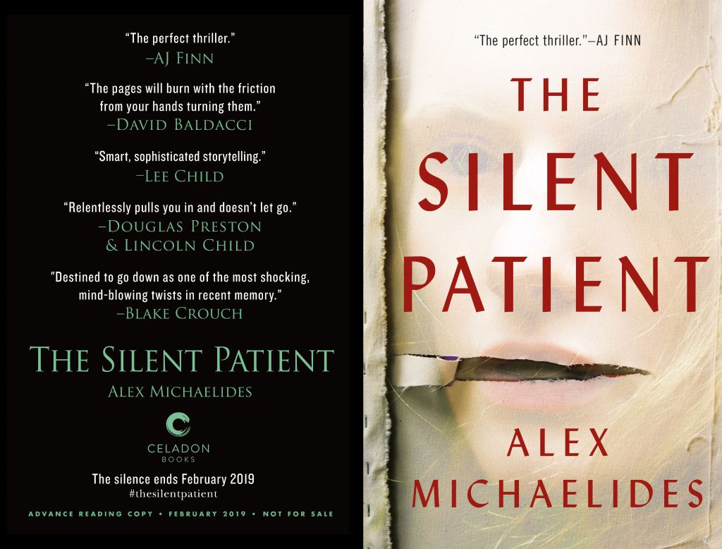
In The Silent Patient, the protagonist is a painter. I found myself drawn to continue exploring painting as a theme for the design. I could have tried to replicate the paintings as described in the book but felt that there needed to be some room for the reader’s imagination through the author’s words. I kept thinking, however, I still wanted to allude to painting, perhaps through some other means. Eventually, the idea for a painting of a woman with some damage to it kept resurfacing for me.
2. What was your initial vision for the cover of The Silent Patient?
I initially envisioned torn paper revealing the word “Silent.” I ripped some watercolor paper in a way that unfurled to reveal first the word “Silent” and then a bust of a Greek goddess’s mouth much like Alcestis’s. The Greek tragedy Alcestis is an underlying theme of the book.
3. How did input from the book’s author inform the cover’s aesthetic?
With The Silent Patient, we showed my early designs that featured a series of torn watercolor papers to Alex, the author. He liked the direction, but suggested we move towards canvas instead, as the heroine paints with oils, not watercolor. He was right, of course—and I agreed we should be more authentic to the story. Thankfully, the pivot was not too difficult to make as we were still in initial designs.
I’m a painter by training, so I actually have a lot of past paintings and stretched canvases at my house. It was simply a case of photographing some initial tests, which I did with my iPhone on my deck, and then showing initial designs for another round of feedback.
The raw canvases that I stretched myself many years earlier were worn naturally with time: threads hung frayed at the edges and the staples binding wood and cloth were lightly rusted and placed in a way that only a human hand can master. The details made the difference and everyone was excited about this direction, so we had the same canvases professionally shot. I particularly like how the threads aligned with the details of her blowing hair in the end.
Related article: Alex Michaelides, Author of The Silent Patient, on Writing the Perfect Thriller
4. How many different cover designs did you create for The Silent Patient?
Many designs were done, even once we were happy with the series of canvas photographs I was working with. At one point, I was exploring about five different themes and each theme had about five covers with different type layouts, fonts and color schemes. So it’s safe to say that at least 50 covers were done. Because of this ongoing process, I like to say, “Design is a verb.”
Some of the themes explored included painting studios, paintings, a rip obstructing a mouth of a woman or a Greek female bust, and many variations of the tear and the torn canvas.
Almost as important as what we explored that went on to influence the final design are the designs that didn’t work. For instance, psychiatric wards and paintings of women with the face blurred as if wiped by a painter were interesting but felt too amateur.
5. How did you land on this as the final design? How do you know when a design is right or finished?
The standard was high for this wonderful suspense thriller that happens to also be Celadon’s first release.
This particular photo of a woman, which came with my third round of photo research, really caught my eye. It was a little haunting and seemed to really capture the protagonist. With a little Photoshop magic, I was able to ghost her back on the canvas as a secondary or tertiary read. When I thought I had the right placement of the rip over the mouth, I took a pause. I had a few doubts — one being that it was a light cover, which is not always embraced by the sales team for a thriller. Fortunately, our publisher, Jamie Raab, said, “I’m not concerned about a light thriller cover. We’ve had successes with light thriller covers it the past.” And fortunately, everyone from editor to publishers to author to agent agreed.
6. Nowadays, it’s important that a cover looks as good on a digital screen as it does on a printed book. How did that affect your creative process as you worked on The Silent Patient’s cover?
Legibility and visual boldness have been increasingly important as we now view covers on the digital screen and even sell half our books that way. I easily embraced this shift as I had worked with mass-market covers in the past and pride myself in doing work that is both elegant and bold. I remember a time when all literary book covers had the tiniest type. From the perspective of type, the covers before digital sales were easier to design, as they tended to be image-driven.
In contrast, type-driven covers require an expansive knowledge of type. I’ve always considered myself a type geek; I love and have continued to study the craft—it goes so deep. Increasingly, type is having a revival, as millennials have been very interested and savvy about type design. There is so much talent out there in type design and hand lettering, so I also love to commission bespoke work for the right cover. In fact, in the past few years, with my design process, I often start with the type layouts and work with relevant imagery later.
I think a lot of top cover designers do this now. It’s been a natural evolution from a sales team dictating, “Make it bigger!” to designers embracing bold elegant type from the get-go. For The Silent Patient there were several options but in the end I chose a “humanist” font, which has influences from both ancient chiseled type and the calligraphic style. Humanist fonts have an ancient/modern quality, my favorite aesthetic, and are most legible online.